Mons
Problem
Design a visual identity for the high end climbing and outdoor brand Mons with the feeling of clean and stylish design meets the outdoors without using just green colors.
Insight
Nature means a lot of space and harmony, less clutter means less stress.
People are stressed and need a space to think, space to breathe, a space for harmony. Incorporation of a lot of space in the design was key to make it feel closer to nature.
Idea
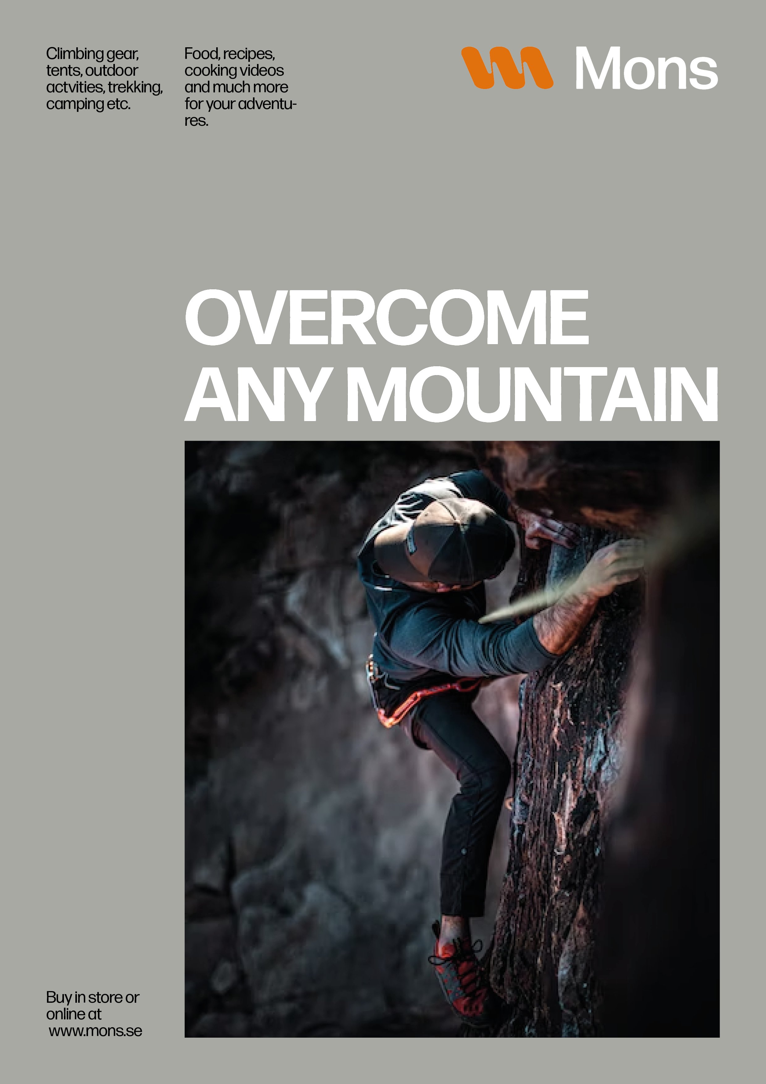
By using a lot of space, and shorter texts and big headlines the design is precieved as clean and open, like nature, free.
Made by
All made by me, Cornelia Holm.
Visual Identity
Art Direction
Advertisement
Product Design
UX Design
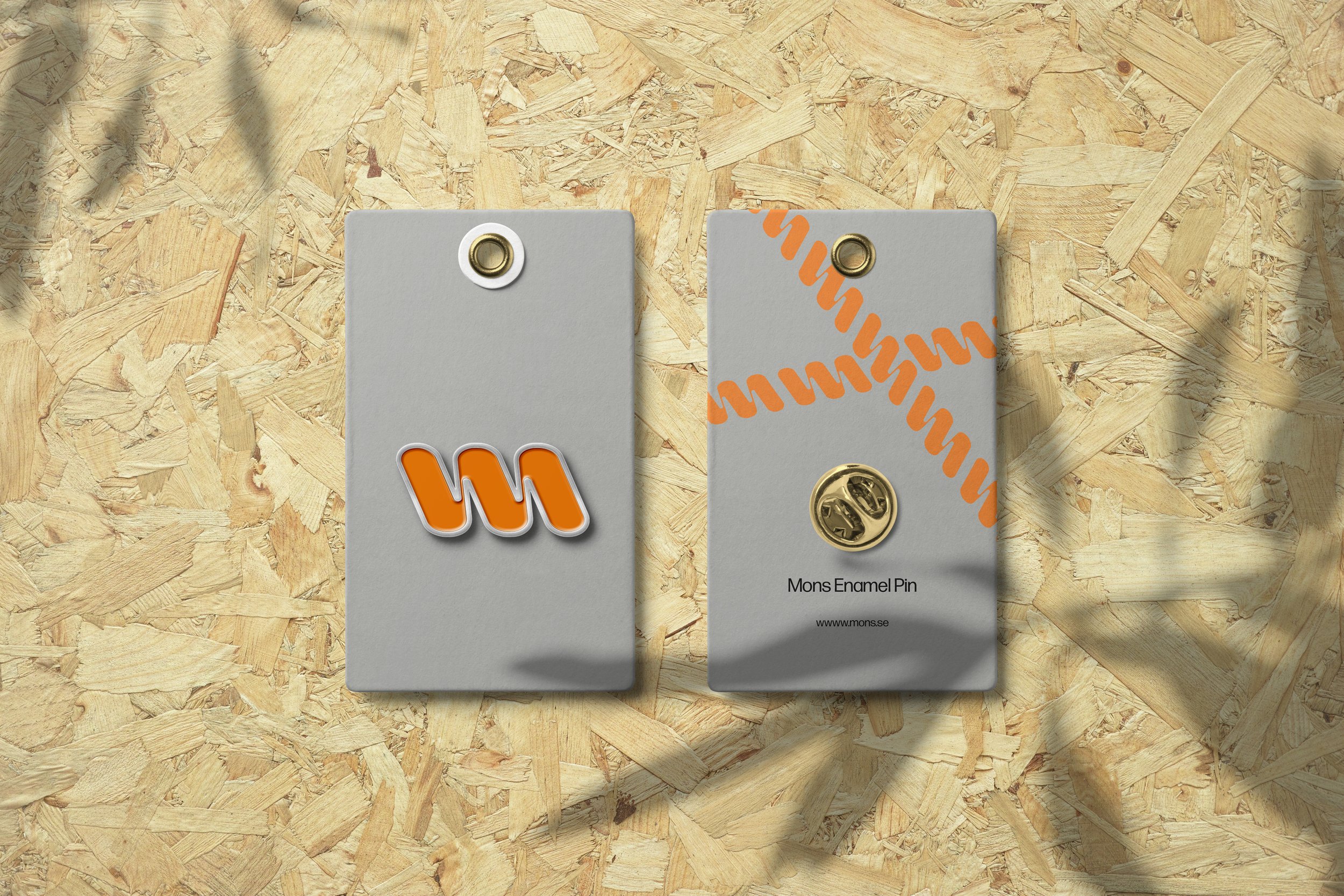
The pattern of the logo reminds of a rope, which is always used in climbing.
The logo is created from the inspiration of ropes, the one constant thing used in climbing, as well as trekking and camping. Ropes are your lifeline, and this is where Mons comes in, as your lifeline in the wild.


